Are you blue? That’s just fine! Colors have a powerful effect on our mood and mental state. When you’re at home, surround yourself with colors that reflect the mood you’d like to be in, not necessarily the mood you’re in at the present time.
Here is a guide to color psychology and how color affects mood.
Blue
Blue is a very popular hue. In fact, a study at the University of Maryland found that both men and women selected blue as their favorite color. Blue has also been sound to soothe nerves and concentrate the mind – both good qualities for when you want to relax. Choose blue when you’re unwinding at home – perhaps with an in-home massage. Blue is a good color for bedrooms – add a splash of blue with flowers, like irises.
Red
Red is a strong color – on the color spectrum, red is the longest wavelength. Red is associated with passion, anger, and energy, perhaps because of its association with blood. Indeed, scientific studies have found that the color red can give an edge in athletic competitions and can improve mental focus.
Black
Black is a powerful color. Sleek, it is the combination of all colors. Black is associated with mystery, power, and protection. It makes a great accent color, but too much black in a room can give it a dark, depressing feeling.
White
White is strongly associated with purity, light, and cleanliness. This neutral shade works well in bathrooms, and for sheets and towels. An all-white room, however, can invoke images of hospitals or medical centers – not necessarily the most relaxing atmosphere. Mix white with other calming colors, like pink, blue, and green, when you want to soothe yourself at home.
Purple
Purple is a rare color in nature, and associated with royalty and mysticism. As the combination of soothing blue and energizing red, purple, depending on the actual shade, can have different effects. Typically, cooler, lighter shades of purple, like lavender, will have similar calming effects as pink and blue, while deeper or redder shades of purple will have an energizing or powerful presence.
Green
Green is the color of living things. Green is also exactly in the middle of the color spectrum, which makes it an easy color to view and enjoy. Use green in places where you want to contemplate the planet as a living, breathing organism, or just to unwind. Plants are an easy way to bring green into rooms as well.
Pink
You may have heard of the hue millennial pink. Just as avocado and orange were all the rage in the 1970s, the 2010s belong to this soft pink shade, just shy of bubblegum. In these stressful times, there may be good reason why millennials (and others) are drawn to pink – its association with childhood and gentleness.
Yellow
There’s a reason taxis are yellow – the color is attention-getting. Yellow is a high energy color, which means it is less restful to view. One study claims that babies are more likely to cry in a yellow room. Choose yellow for active occasions – perhaps a pre-marathon sports massage – but avoid for times when you need to rest.
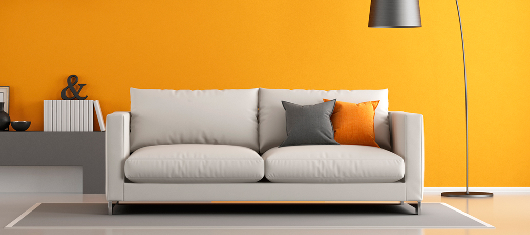
Orange
Like its fellow warm colors yellow and red, orange is a high-energy color, with a warm, positive feeling. Choose orange when you’re seeking to feel friendly, extroverted, and energetic. Orange, along with red and yellow, can also make you hungrier – there’s a reason why fast food restaurants typically opt for logos in those shades.
To summarize these color psychology tips:
Choose these colors for relaxation at home:
- Blue
- White
- Pink
- Green
- Lavender
Choose these colors for energy and alertness:
- Yellow
- Orange
- Red
Choose these colors when you want to feel powerful:
- Black
- Dark purple
